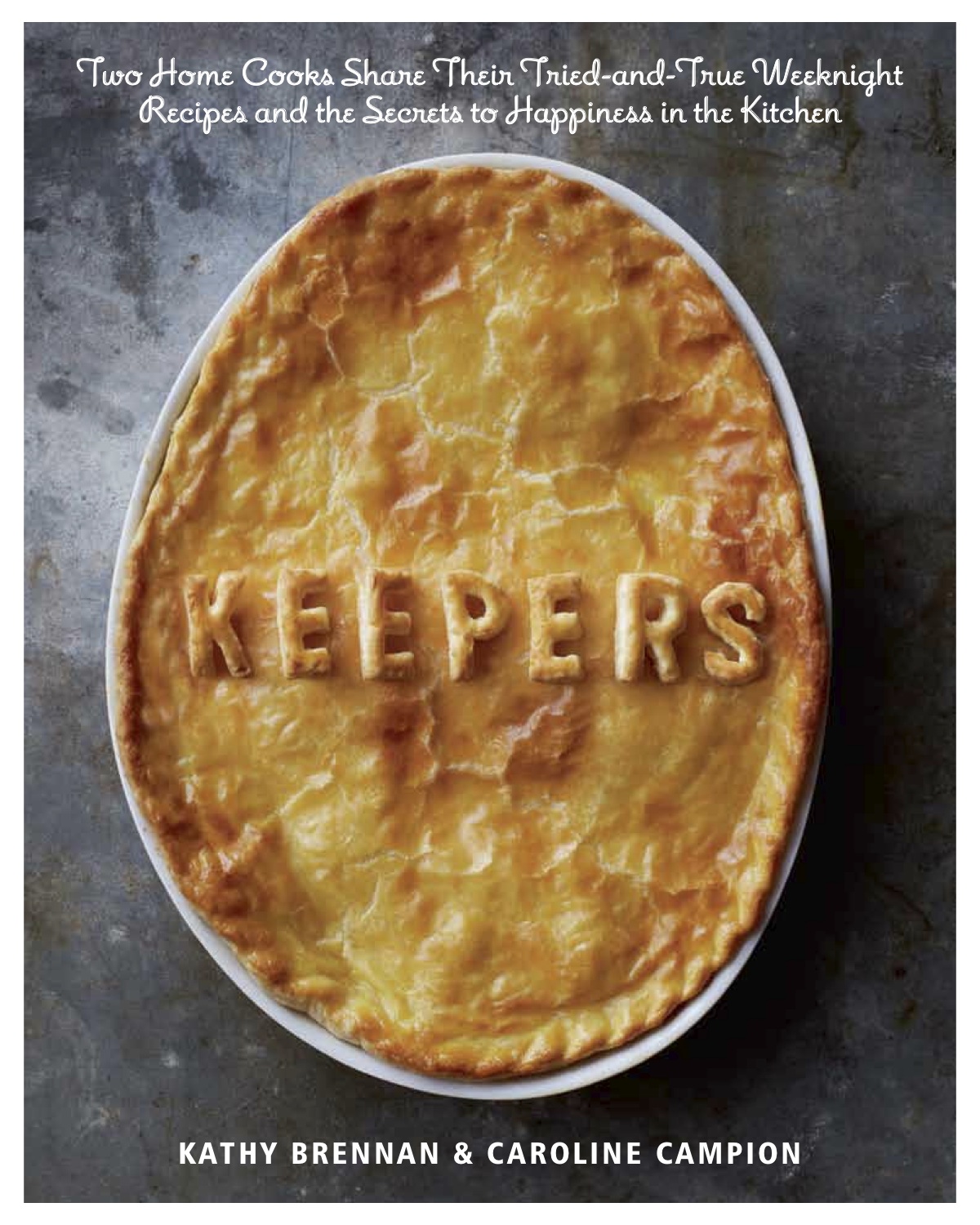
 You may have noticed that I’ve been posting a bit less lately. I can tell you that it’s not because I’ve become very lazy or decided to throw in my apron. The reason for my infrequent blogging is the book pictured above, which has taken over my life (in the best possible way). But finally, after two years of cooking, eating, testing, writing, cooking, editing, and picture-taking, my co-author and I are in the homestretch of seeing our very first cookbook—KEEPERS—published. I can’t believe it.
Although the publication date is not until August 20th (if you’re interested, you can even pre-order it HERE!!), I wanted to share the cover with you. The photo is of a family-style, single pot, chicken pot pie, which is one of the recipes in the book, but also one of my favorite things to make (and eat) on a weeknight. The choice of using a graphic image like this for our cover was actually a bit controversial. I LOVE it–but what do you think?
I can tell you that I’ve studied a lot of cookbook covers and they typically fall into one of the following categories:
1. A refined cloth-cover or text-only cover, which only Europeans and a few cool cats can get away with. An example of this type of book are the ones by Alice Waters or Mark Bittman, classics like The Joy of Cooking, or The Rose Bakery cookbooks, like one of my faves, Breakfast, Lunch, Tea. These books just need a stylish font and a title to get across their message.
2. The food porn cover. A piece of lasagna with cheese practically oozing off the spine, or a rich frosting-laden chocolate cake…these titles are meant to lure you through your belly. I get it. But I might argue that something oozy can never become a real classic cover. The exception to this is something like the new Bouchon Bakery book; in my opinion their cookie sandwich looks both delicious and classy. And also the pomegranate-studded cover for Plenty, which is my idea of the perfect thing to eat.
3. The smiley celebrity author, who sells books just by putting their mug on the cover. This works if you’re Barefoot or Jamie Oliver, but I’m always surprised when an unknown puts their photo on the cover. I’m both too unfamous and too tragically unphotogenic to even consider doing such a thing (You think I’m being falsely modest? The New Jersey DMV actually broke their hard-and-fast rule of only allowing three photo tries when I went in for a new license, because my first attempts were so bad, I made the employees laugh out loud).
4. The single ingredient shot. Also a classy move, but I worried about the book seeming too twee or removed for the everyday home cook if it was only bedecked with a bunch of herbs or a frolic of figs. An artful display of figs can be a thing of beauty, but the last time I tried to buy figs they were very mushy and made me sad. They would also make my family sad if I tried to serve them for dinner.
I can tell you that our cover was a real labor of love. The pastry letters (which you are not required to make if you try the recipe) are real and were crafted in the wee hours by my partner in crime, Kathy Brennan. We did them during the week-long shoot at my house (which I chronicled HERE, if you want to know what it’s like to live through a cookbook photo shoot), and after experimenting with all manner of cookie-cutters and stencils, Kathy got the best results from tracing Belle and Conor’s magnetic alphabet letters (you know the ones). I think they are so original and, along with the pot pie, speak to the spirit of the book:Â homey, warm, memorable, sensible, but also a little whimsical. I hope you agree.
There will be more KEEPERS news as we get closer to our pub date; but I will also do my best to get back to posting. I promise.
And let me know what you think of the cover!!
(Also, here’s one more place to pre-order HERE!)